
Obie
UX/UI DESIGN
SAAS DESIGN
CONTENT STRATEGY
Streamlining an onboarding process that focuses on trust
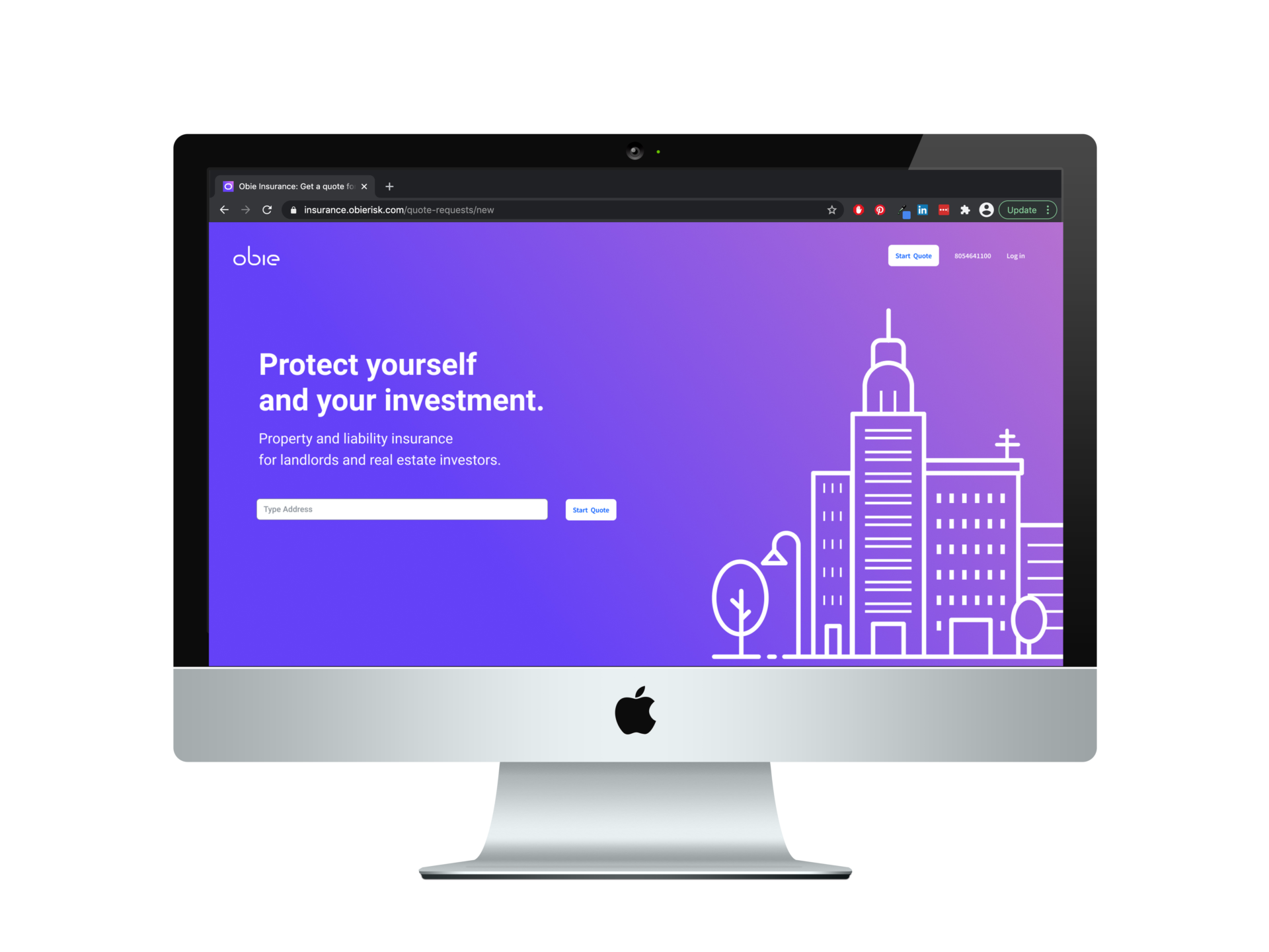
Obie is a real estate insurance company that is developing an alternative to a brokerage. Their onboarding is to help automate the insurance process and to get insurance quotes as quick as possible.
THE PROJECT
The project is to look at the current onboarding process and find ways to improve on the userflow, user interface, and user experience. This can mean reducing the amount of steps, convey more effective information, or revising questions.
ONBOARDING OVERVIEW
Usually real estate insurance brokerages is filled with a lot of questions to help find the right insurance and coverage for the customer. Obie is trying to find the balance of asking the right amount of questions while automating the quote process.
That's why the the onboarding process is the lifeline for Obie. By finding a solution to simplify the process for the users, it'll take less time to connect the customer with a compatible insurance company.
COMPETITORS
By researching more about competitors, you can understand what makes your product unique. Most of Obie's competitors are still the traditional mom-and-pop brokerages where people either come in or talk over the phone about the right kind of coverage. There are a handful of web-first brokerages on the market like ValuePenguin and Insureon.
There is still plenty of indirect competitors that can be looked at as well to help progress Obie's onboarding process, mainly the car insurance industry. They can include from insurance companies like Progressive, or brokerages like The Zebra.
PERSONAS
Personas were given. They help guide the design process by uncovering pain points, motivations, and behaviors of Obie's audience. This is usually done by asking them questions and having them interact with a feature/features on the platform.
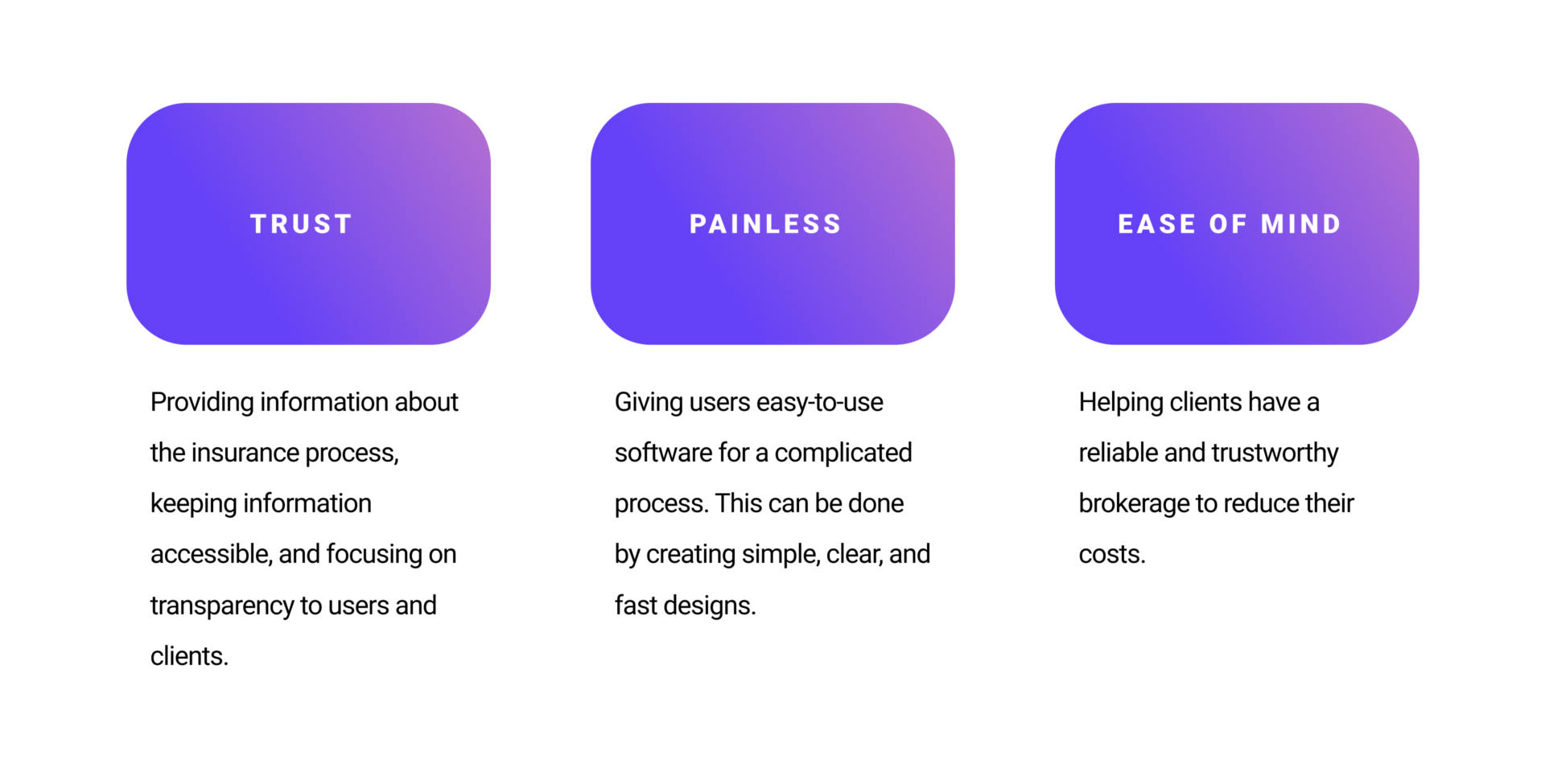
EXPERIENCE PRINCIPLES
By reviewing the personas given, I built out 3 principles that helps provide direction of the flow and design of the onboarding process, as well as Obie as a whole. They include Trust, Painless, and Ease of Mind.
USERFLOW: OVERVIEW
The current userflow on the Obie website is a bit different than the flow given to me. I decided to base my version of the userflow based on the website, while referencing the old one. There's a lot small changes that dramatically changed the way users might experience the onboarding process.
High-res version is here.
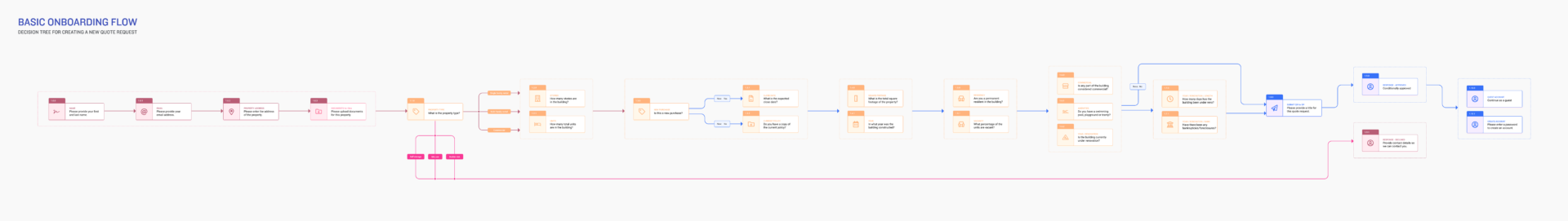
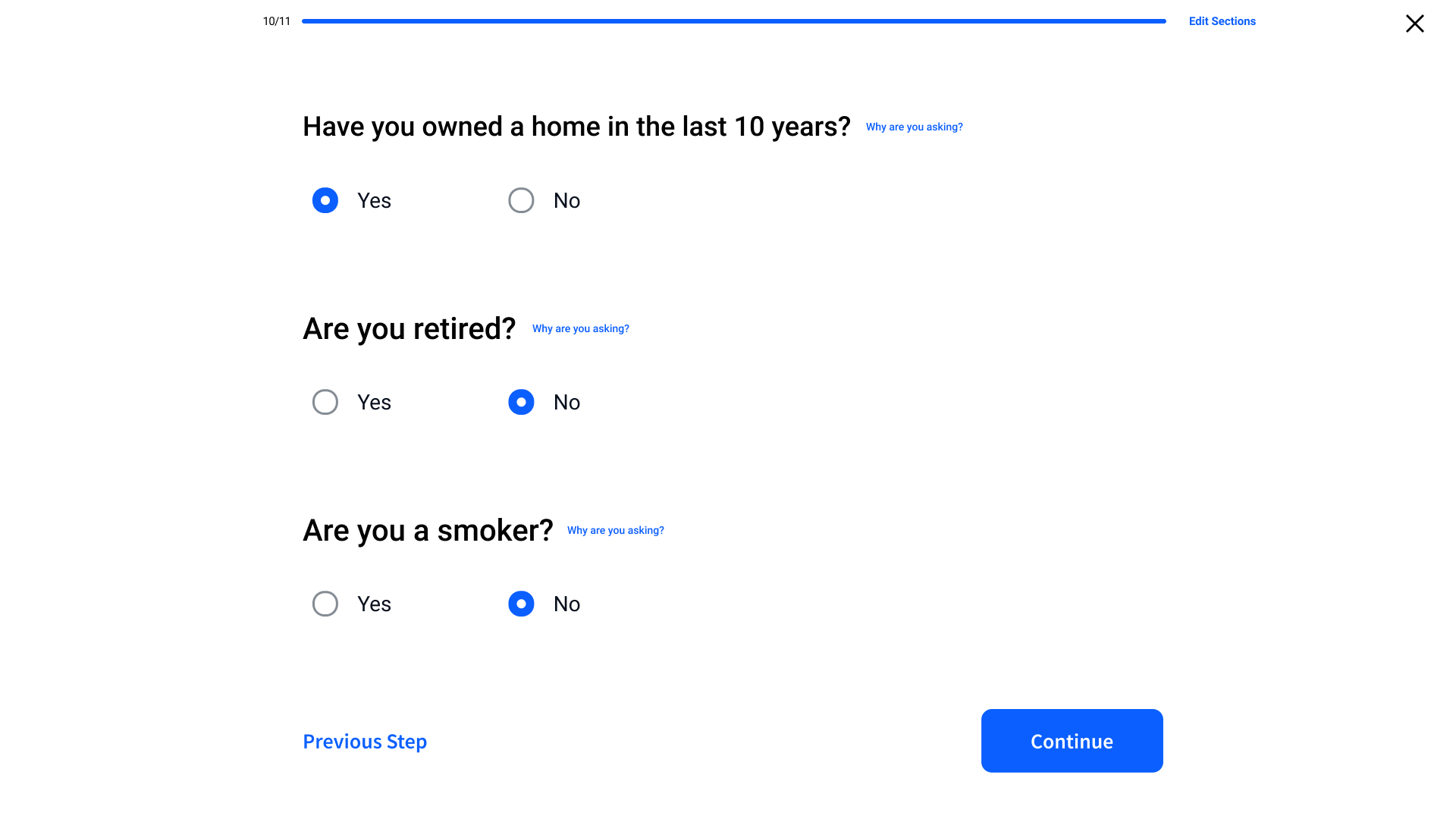
The main rule for the new userflow is that each page has 3 questions or less. This helps the users think that the onboarding process is easy and it won't bombard them with a billion questions per page. The only exceptions are the first two pages that focuses on creating an account.
Each screen in the userflow is now color coordinated to show how different input functions will be used.
High-res version is here.
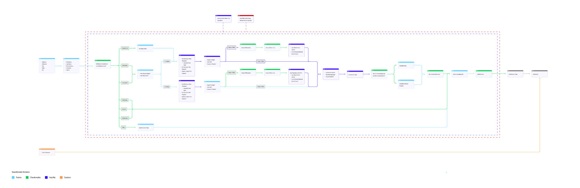
USERFLOW: MAJOR CHANGES
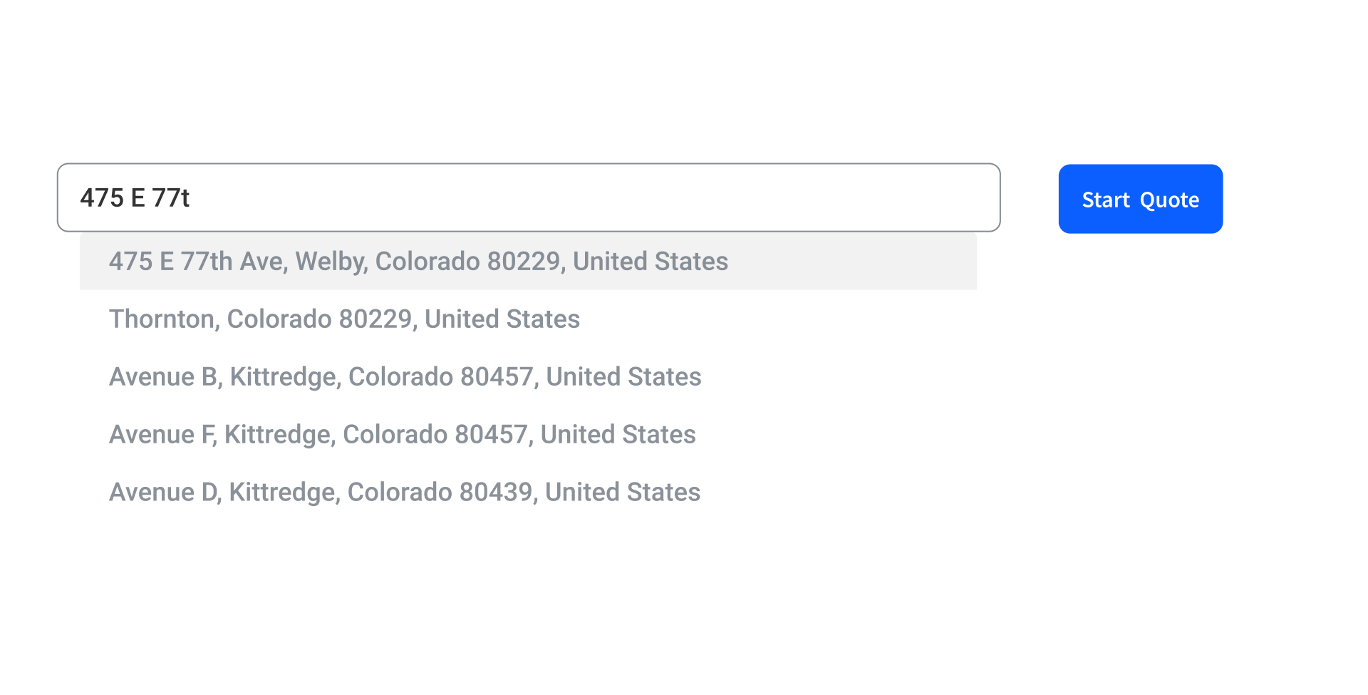
The biggest challenge was trying to figure out when users should make an account, like name, address, email address, and password. Accounts need personal information which makes the users wary if not done right. Accounts are made at the end of the onboarding process so that users have built a sense of trust and started to utilize the sunk cost fallacy.
It was decided to put it in the beginning for two main reasons. The first is that this company is a real estate brokerage, so putting an address and a name is almost expected in this industry. The second is that by setting up an account at the beginning, users can log back in if they decided to not finish the onboarding process.
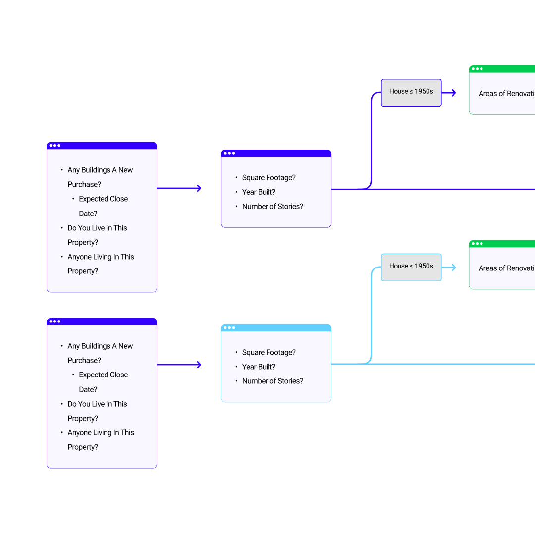
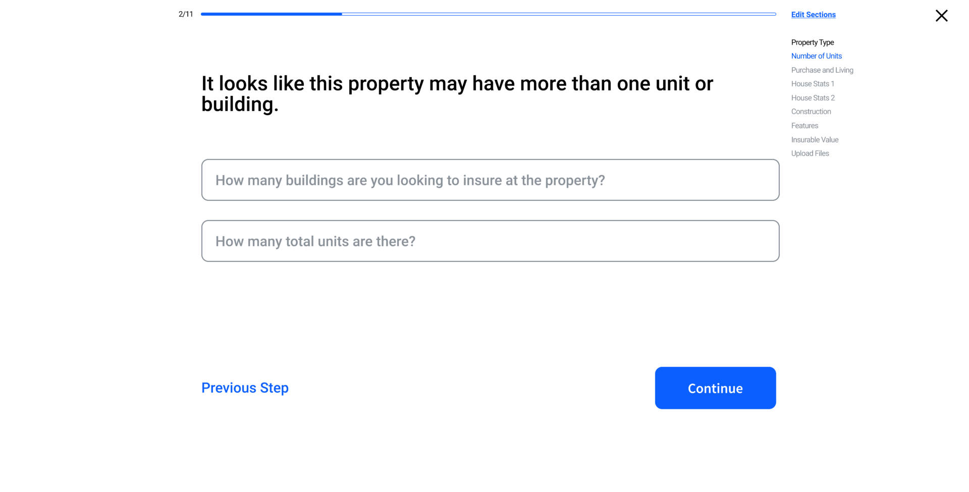
The current onboarding process questions is only geared towards singular buildings, even though there is an option to insure multiple buildings. The new flow now has trees for people that wanted to insure multiple buildings. While the questions are similar to single buildings, the input function changes.
Another issue is that there's more questions that need to be answered when a house is old. The new process has condensed the questions into 3 pages instead of 6. It is also developed as a pop-up, that way it keeps the user from being demotivated and inattentive.
USERFLOW: OTHER FEATURES
A phone number to call a broker at Obie was added as an alternative to the onboarding. This was debated if it was needed or not, because Obie is supposed to be an automated process. However one of the main personas is homeowners that are 55+ years old that still rely on the telephone, and having a phone number accessible is a good way of mainting users in that persona.
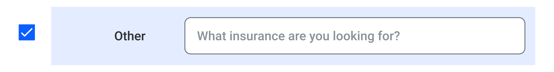
A new property option "Other" was added to help generate any new leads that weren't in a predetermined category. This also helps Obie give more information about what insurance onboarding process that they should focus on next.
Due to different laws and regulations over local, state, and national levels, Obie needs a way to implement specialized questions based on region. Pop-ups is the easiest way to gain new information whithout fatiguing the user.

SCREENS: USER INTERFACE
Note that these are wireframes.
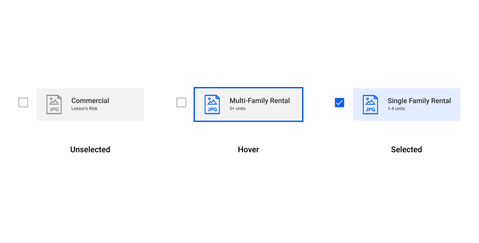
Radios replace the buttons that are on the current onboarding process. This was done mainly to increase more white space per page and to add more questions cleanly. This also creates a distinction to the "Continue" button at the bottom.
Confirmation indicators were added to the input forms to inform users that it either got process correctly or not.
Checklists also got an update for confirmation and hover effect. Originally the hover effect was just a blue border. However with the new system, icons would be colorized as a second indicator. Confirmed actions now have the icon colored, as well as the container colored.

SCREENS: USER EXPERIENCE
Note that these are wireframes.
One of the main goals is trying to keep the questions above the fold. This makes the process easy and fast for the users. When there's too much scrolling and too many questions per page, the user gets demotivated.
To create an incentive to finish, a progress bar was added. This helps users have a goal to finish. There is also a way to navigate back to sections that was filled. It is under "Edit Sections". The sections are under a dropdown because seeing 10 pages of questions could overwhelm the user and might drop out during the process.
Optional informational pop-ups are added next to specific questions. The goal is to create more trust with the users by showing credibility and transparency to our questions.
Results
Developing trust from users is still the biggest challenge. Adding hyperpersonalization features would have helped, like adding the user's name in some questions. Another way is to change the copy to a warm personable voice, compared to clinical and cold.
Here are some numbers:
• Reduced steps from 16 to 10 steps
• Reduced 40% or scrolling usage
Credits
Director of Product Design — Adam Tsouras
UX/UI Designer — Joe Repucci

Want to solve problems? Let me help you.
(805) 464-1100
Repuccidesign.com ©2020