
Mayview
BRANDING
ART DIRECTION
CONTENT STRATEGY
Designing a fun identity for an affordable home goods brand
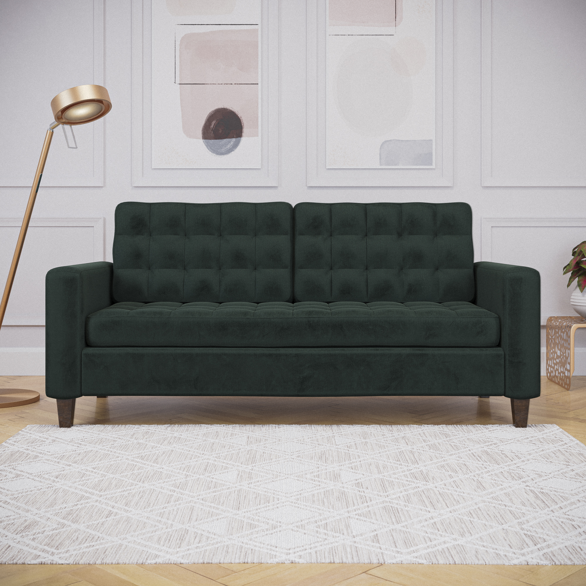
Mayview is an everyday home essentials company that is looking to create stylish products that look and function to their premium counterparts at a fraction of the price.
THE PROJECT
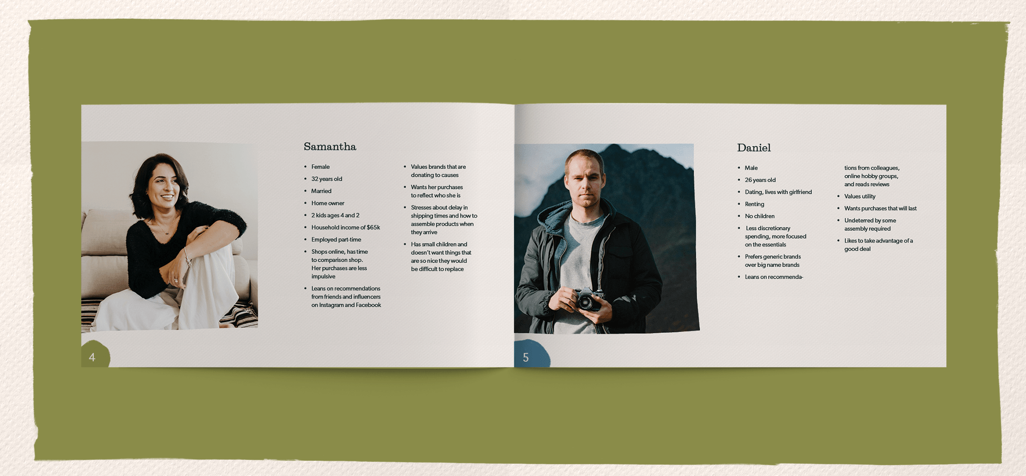
Mayview was looking to stand out on the Walmart ecommerce space. Since the brand caters to a wide array of customers, a brand identity was needed that appeals to all genders, young and old. Looking at the mid century as inspiration, my task was to build out a unique brand identity and marketing materials by working with the brand manager and content managers.
LOGO DESIGN
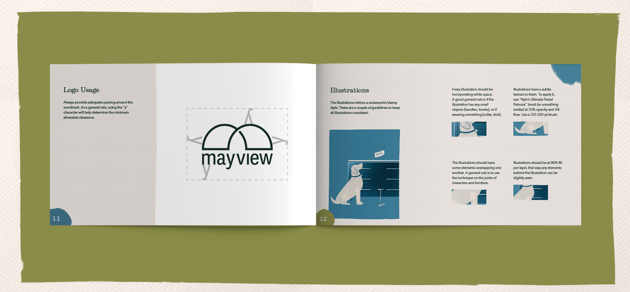
While exploring concepts that convey the idea of furnitue, the use of curves was one design language that kept coming back. The idea of a curved piece of wood shaped in an abstract M is the idea behind this logo.
Creating an opening in the middle also helps reinforce the idea of view or portal that's associated with the brand name.
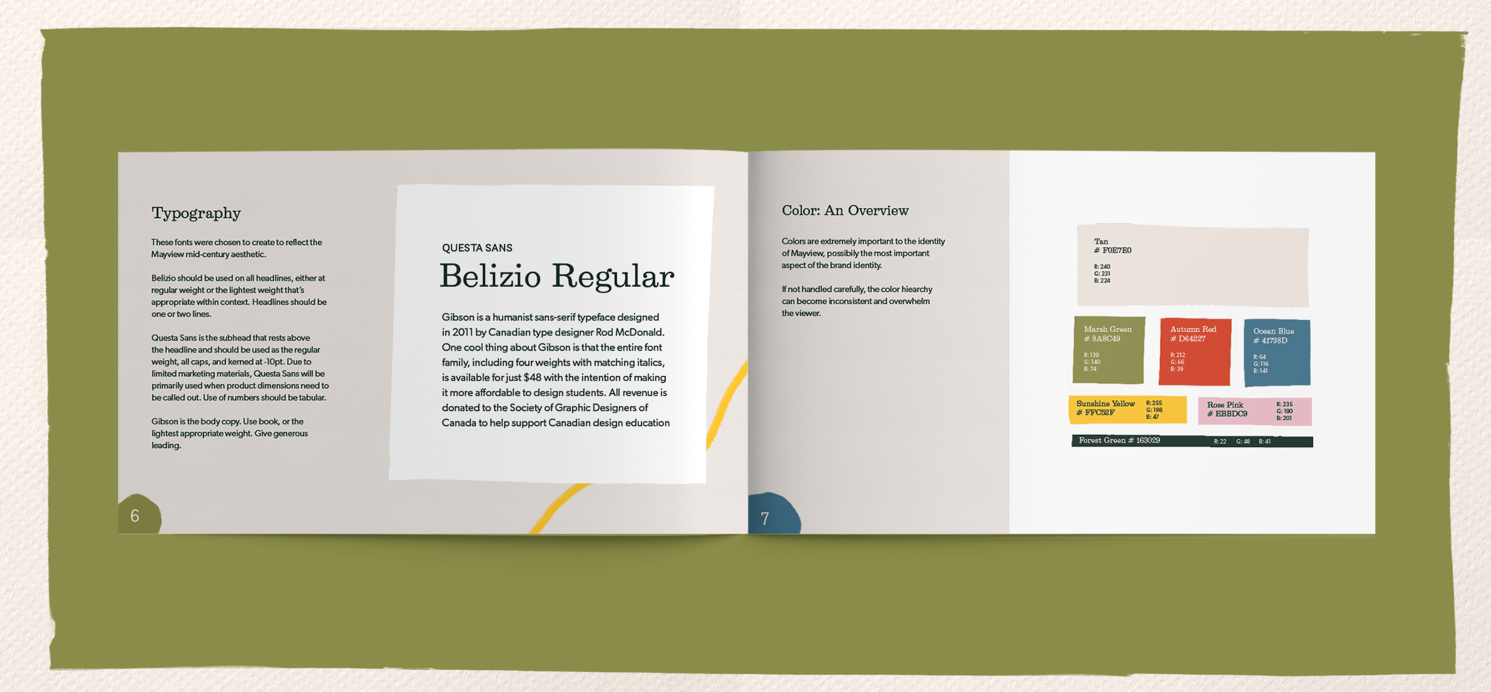
The use of a simple, yet nuanced typeface helps give the logo a timeless, classic look.

BRAND SYSTEMS
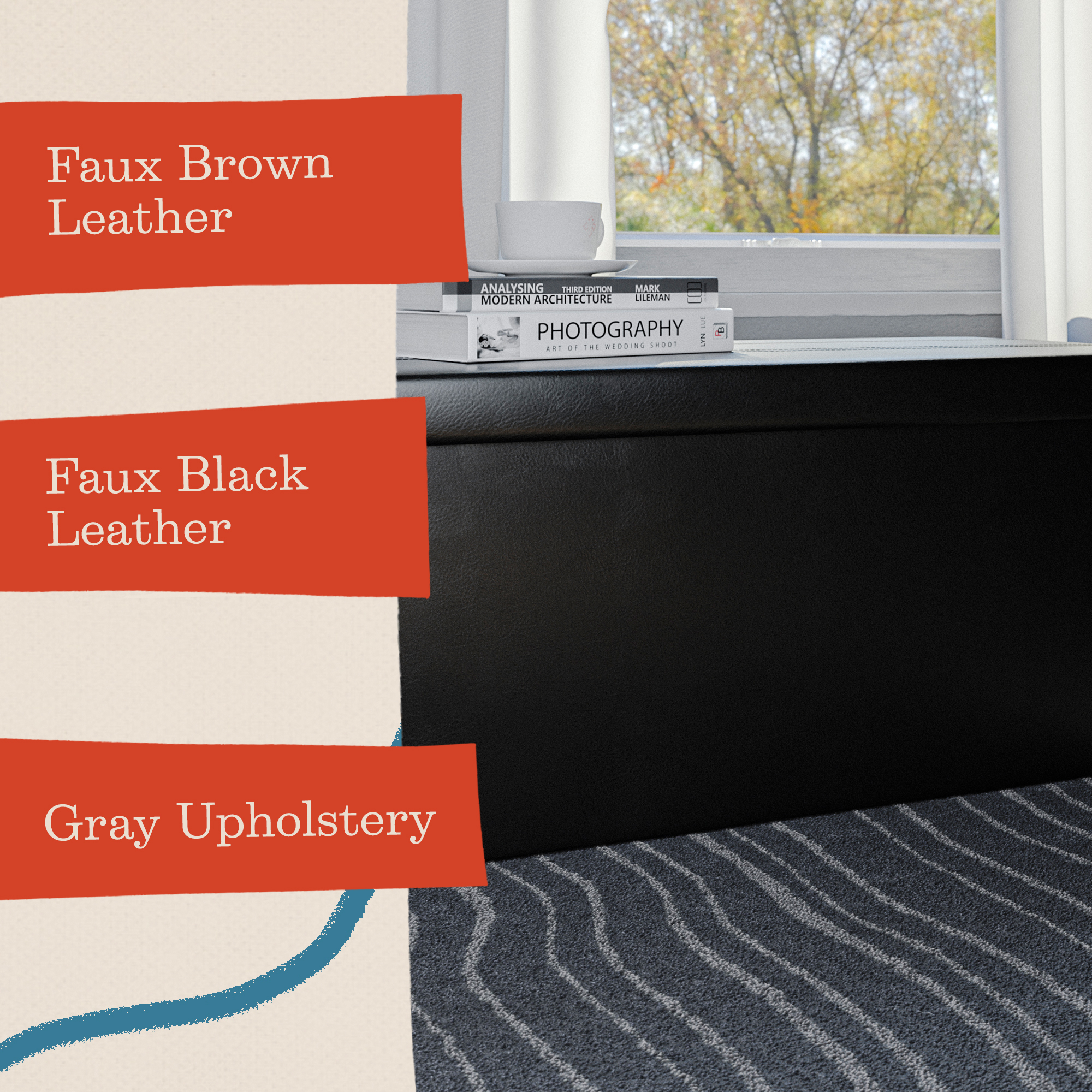
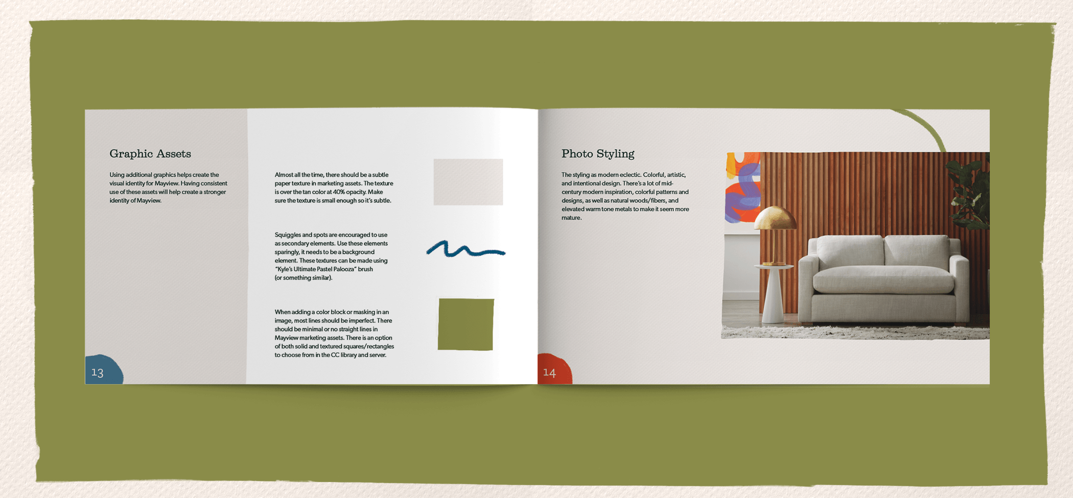
After looking through mid-century designers and artists, an idea of paint and printing techniques were used to create the brand identity in a whimsical way.
The use of fun lines and organic shapes helps convey a sense of fun and lightheartedness. This can be seen as details around the pictures, or cropped around the picture.
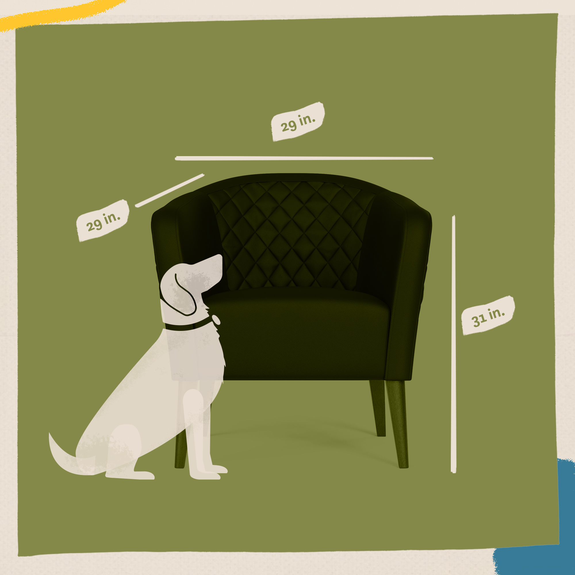
By looking at printing techniques at the time, there was a unique way to show dimensions and the product in scale in relation to the room. This includes the idea of screenprinting and stamping.


Credits
Brand Manager — Keegan Garrity
Art Director — Joe Repucci
Stylist — Taylor Mickelson
Photography — Koltin Darley

Want to solve problems? Let me help you.
(805) 464-1100
Repuccidesign.com ©2020