Maven
UX/UI DESIGN
SOFTWARE DESIGN
Creating in-house design software for non-designers
Maven is a home consumer good conglomerate. It's brands heavily relies on online retail marketing to help sell their products. As the company expands, they needed a design platform that helps streamline production work for non-designers.
THE PROJECT
There are important marketing assets called listing graphics in the online retail industry. As Maven adds new products per brand, it relies more and more on listing graphics to help develop sales. Maven pushes out over 60 products per month, which leaves the design department an enormous amount of production work.
This was a side-project that helps reduce production work for creatives without hindering the production schedule. My task was to research, develop, iterate a solution, and eventually implement the system within the company.
LISTING GRAPHICS
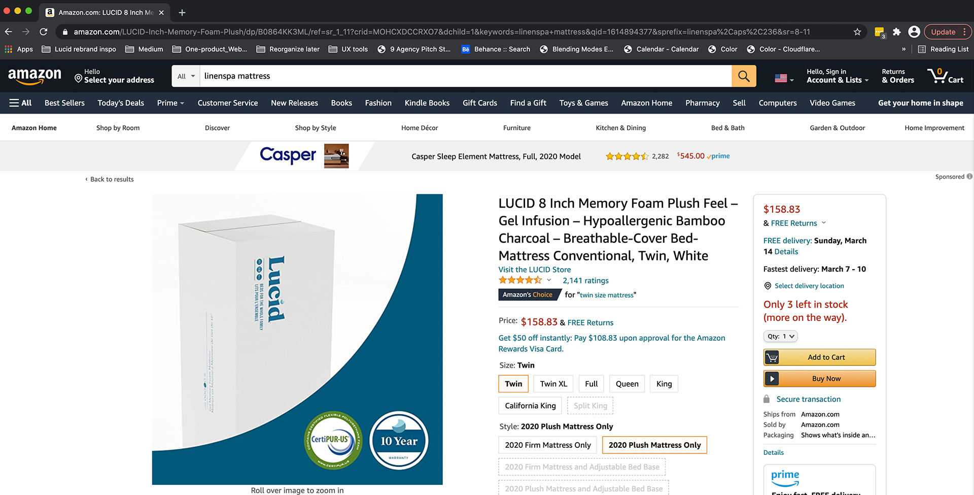
To stay competitive in online retail, good design is a key factor in building trust with consumers. They also include key marketing content to further inform consumers of the product.
Originally a couple small design projects, listing graphics exploded into a full-time production process. Designers were barely keeping up.
USER INTERVIEWS: STORYBOARDING
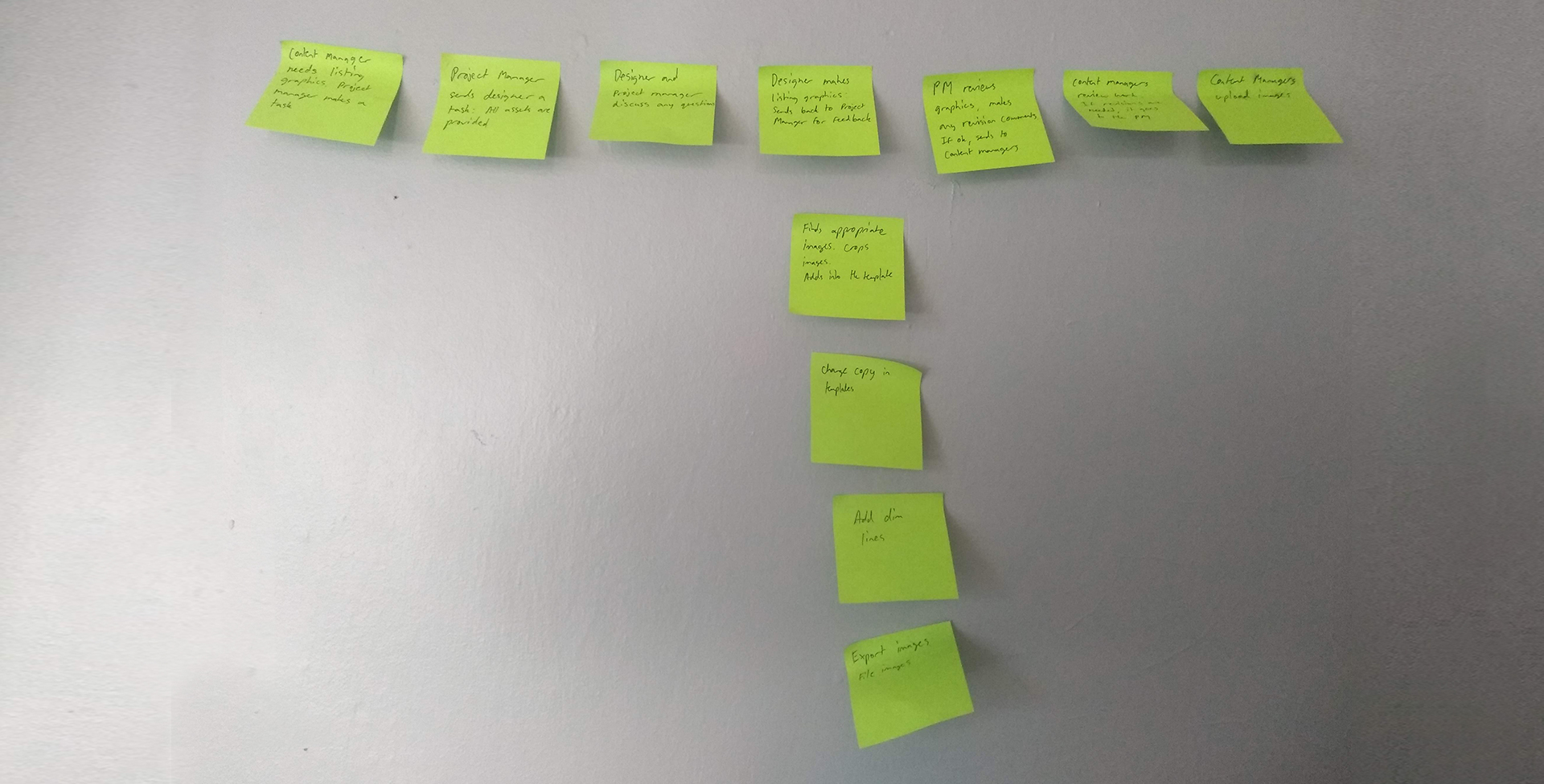
The project was first started by using the double-diamond process to further understand the goals of the project. To understand how the workflow of a listing graphic project, a modified storyboard process was used. There wasn't enough data points for a full user journey yet. This helps understand who is involved and what communication looks like. This was created by interviewing designers, project managers, and then content managers.
USER INTERVIEWS: GOALS
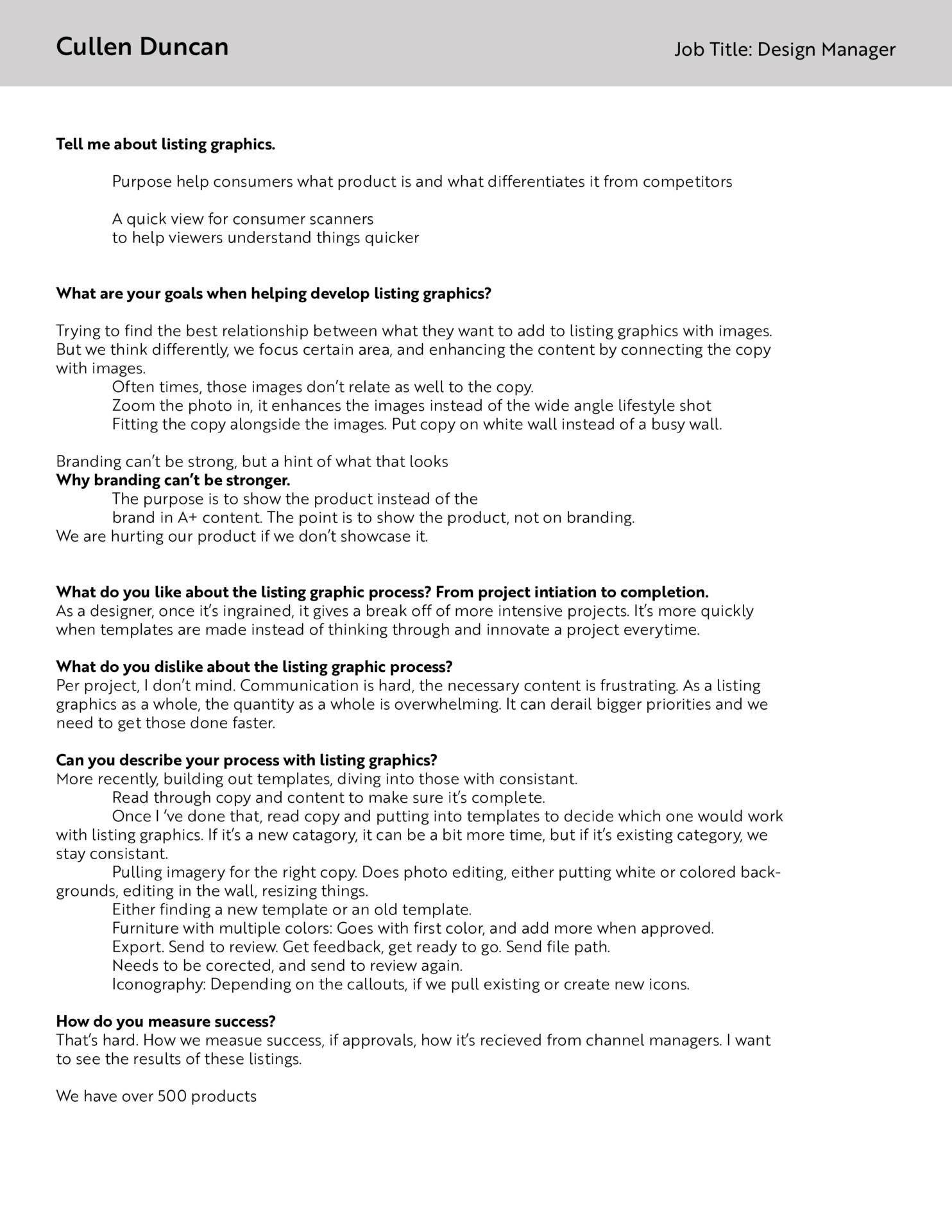
By doing interviews with each job role, more information was uncovered and helped finalize goals. The original problem was to alleviate production work from designers, but in reality the real goals was aimed towards content managers. The finalized goals are:
• Easier design accessibility to content managers for quick edits
• Maintaining good design on listing graphics
• Software is simple and easy to use
The interviews also gave direction to basic experience principles and a new storyboard. This would later help develop the software and it’s features.
DEVELOPMENT AND PROTOTYPES
Developers didn’t want to invest a lot of time and effort into this project without having some initial results first. They’re wasn’t a strong enough incentive to make it into one of their main priorities. They were willing to make a quick prototype for it to work, before building out a system.
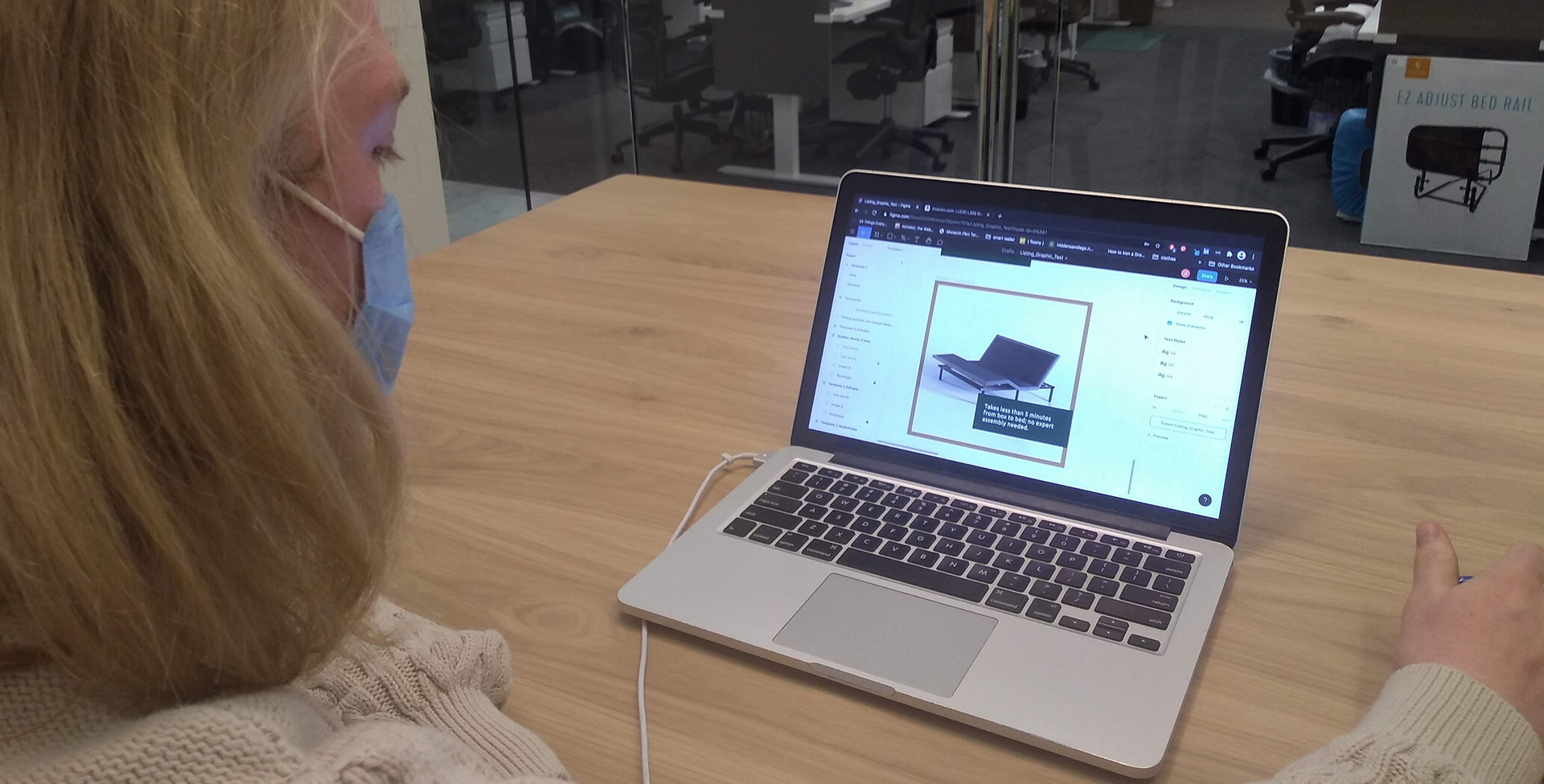
I found a couple of free tools that can accomplish my prototyping goals without getting developers involved. This included the platforms Lucid and Figma. This was a good way to do basic usability testing and to figure out some issues to avoid in our own in-house tool.
Lucid gave too much design freedom for content managers, which lead to too many issues like design hierarchy problems, typography issues, off-brand color, etc.
Figma was was better. But for the system to work, the users have to go through a series of complicated steps to design and export graphics.
These free tools had limitations, but was close enough to use as a prototype to get qualitative results to show to the developers.
USERFLOW + WIREFRAMES
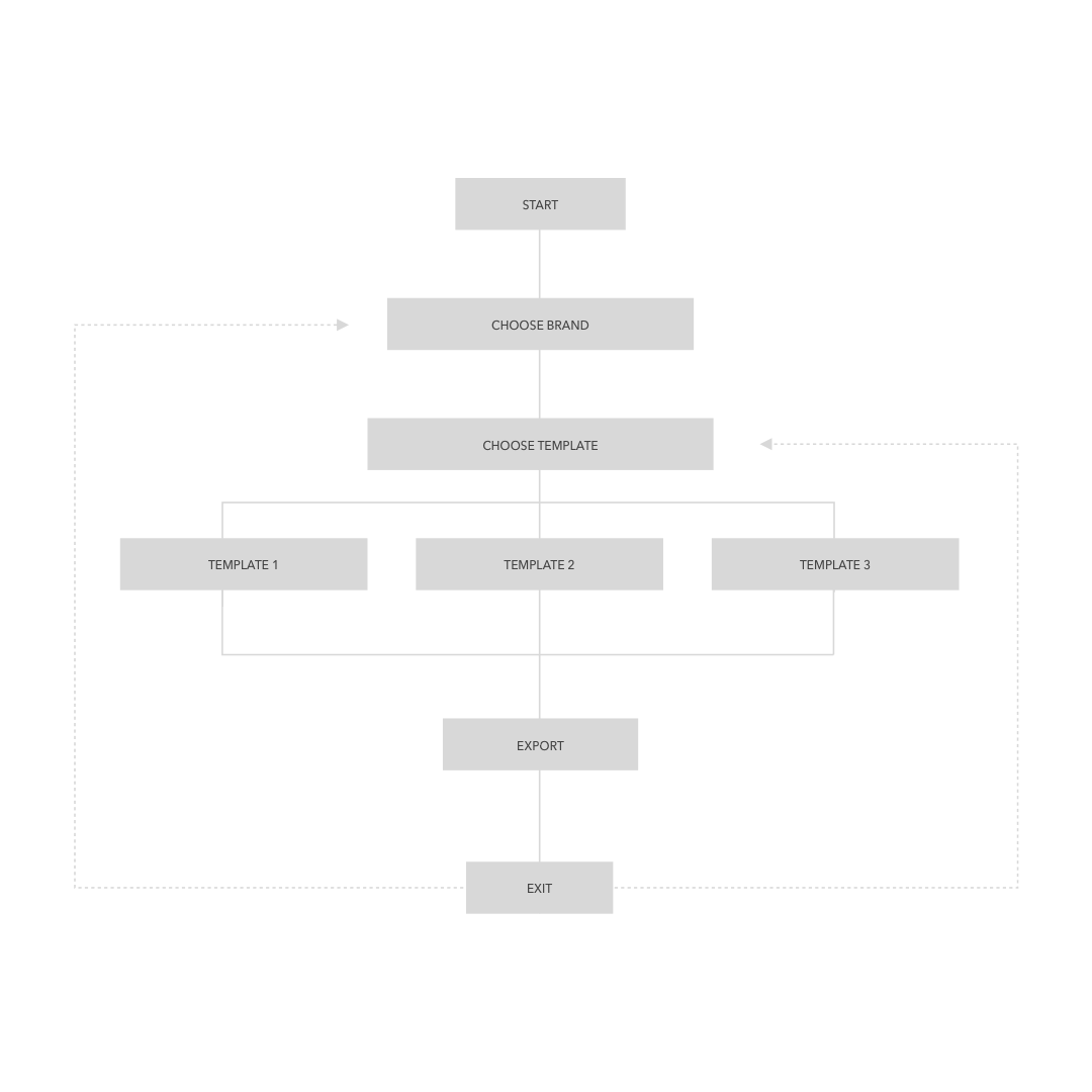
After getting an initial buy-in from developers, a user flow was developed to help understand what features are needed. Features were made based off of the prototype usability tests, storyboard and experience principles. This included having access to different brand templates, exporting button, and design tools.
TEMPLATES
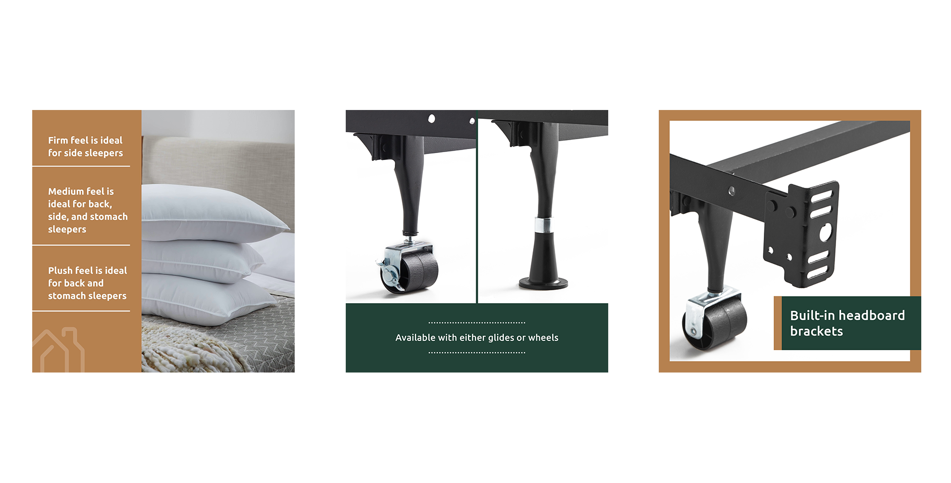
Templates were created to help maintain a strong and consistent design for non-designers to follow. Padding around text and certain design elements were used to create flexible templates.
AXED PROJECT
The company exponentially grew since the beginning of this project, and the project got put on hold. This was going to be in the company's HQ website. While I got positive feedback from stakeholders, it was easier from a company standpoint to have the design department hire one or two full-time production workers instead of implementing a multi-department initiative. Maybe this system will be more useful down the road.
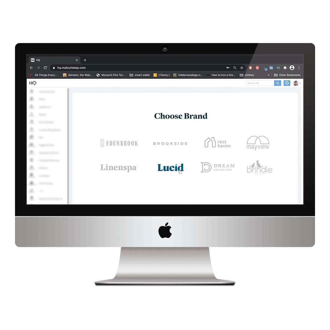
Some elements are blurred out
Results
• Saves design department about 2000 hours a year
• Saves around 72k each year on hiring for design
• Easier A/B testing for content managers
• Faster content edits
Credits
UX/UI Designer — Joe Repucci

Want to solve problems? Let me help you.
(805) 464-1100
Repuccidesign.com ©2020
