Lucid
BRANDING
ART DIRECTION
PACKAGE DESIGN
CONTENT STRATEGY
Rebranding a top selling mattress company
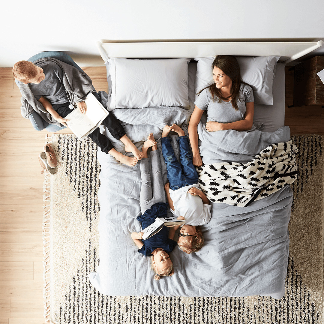
With the company expanding and seeing a change in their demographics, Lucid realized that they needed a more recognizable branding identity in a highly-competitive market.
THE PROJECT
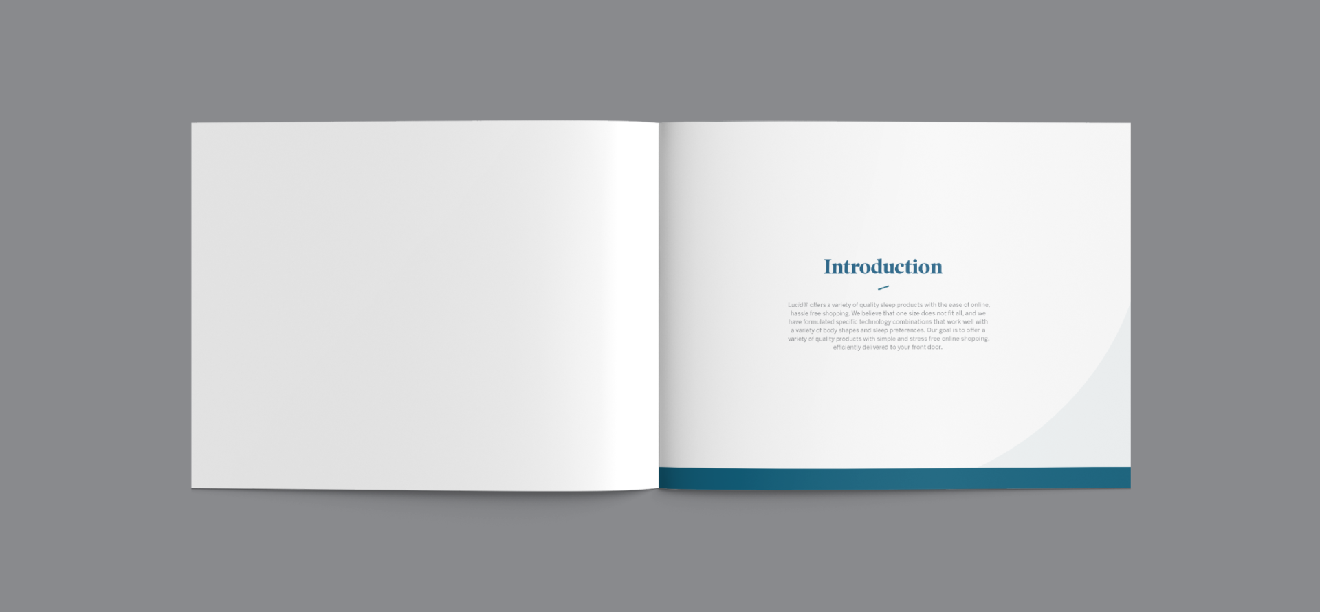
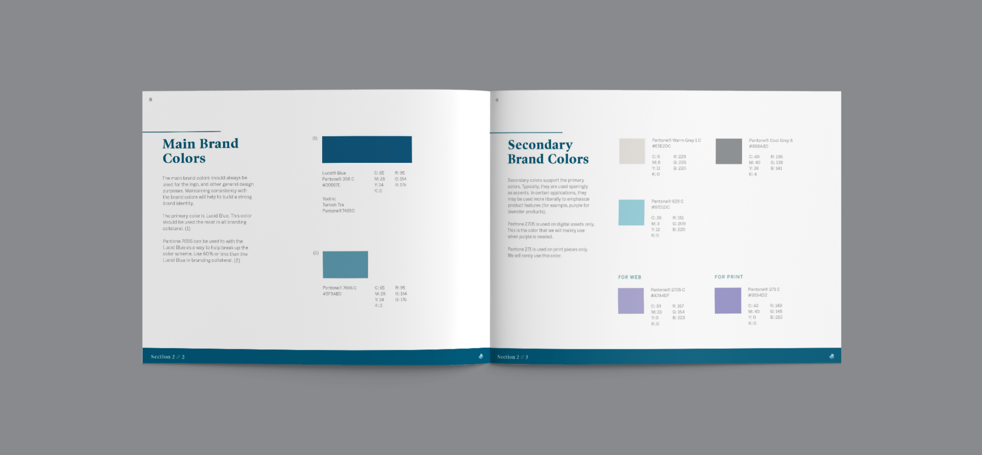
The project is to create a new brand identity system that helps Lucid stand out in the marketplace. This includes creating a visual identity that maintains characteristics from their past while focusing on demographics that are geared towards families. My task was to lead the direction of the new visual identity for Lucid by working with stakeholders, and to help champion designs made by other designers.
LOGO DESIGN
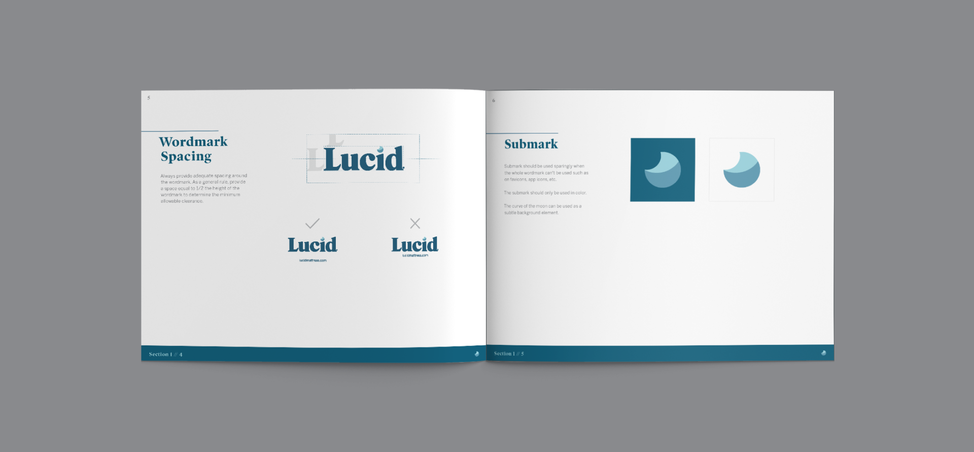
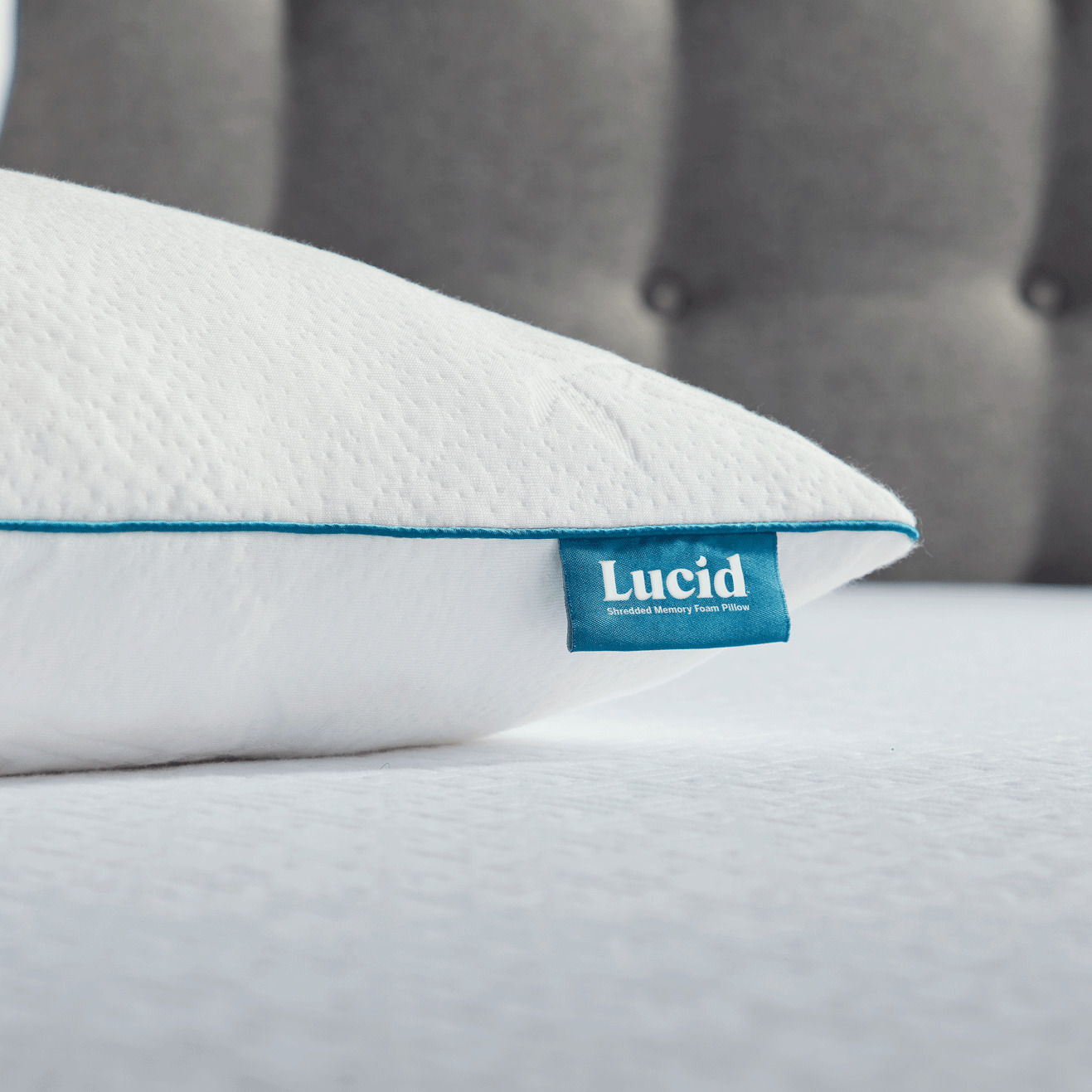
The logo keeps elements of the old logo, including the main color and the serifs. The bolder letters and rounded serifs create a more approachable logo that reflects the demographic and price point. The softer letters also alludes to the the warmth and softness of beds and bedding products. A moon is integrated with the i that works a stand-alone.
The moon is used as an alternate graphic when the wordmark cannot be used. The main strategy is that the mark is used enough in marketing assets that when Lucid becomes a household brand, the moon can become synonymous with the brand.


BRAND SYSTEMS
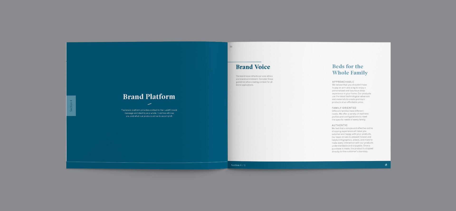
The swoosh from the moon is incorporated into almost all marketing assets. This includes from icons, to business cards, to the website.
PACKAGING
A new set of packaging was developed that reflects the rebrand. Since Lucid lives mostly online and not in retail, the packaging can be more graphic related and less content focused.
Credits
Brand Manager — Keegan Garrity
Art Direction — Joe Repucci & Skyler Musgrave
Designers — Katherine Mansfield
Photography — Donald Scott
Want to solve problems? Let me help you.
(805) 464-1100
Repuccidesign.com ©2020
