
Pure
UX/UI DESIGN
APP DESIGN
Developing an easy-to-use onboarding process
Pure Indoor Cycling, a premium cycling studio, saw that their customer base is growing. They realized that they needed an app to help organize, track, and streamline their classes and services.
THE PROJECT
The project is to design an app that helps the customer with their booking experience with Pure. This includes organizing what classes they booked, services offered, and an easy-to-use purchasing experience. My task was to design the onboarding process that introduces users to Pure and set up individual preferences.
ONBOARDING OVERVIEW
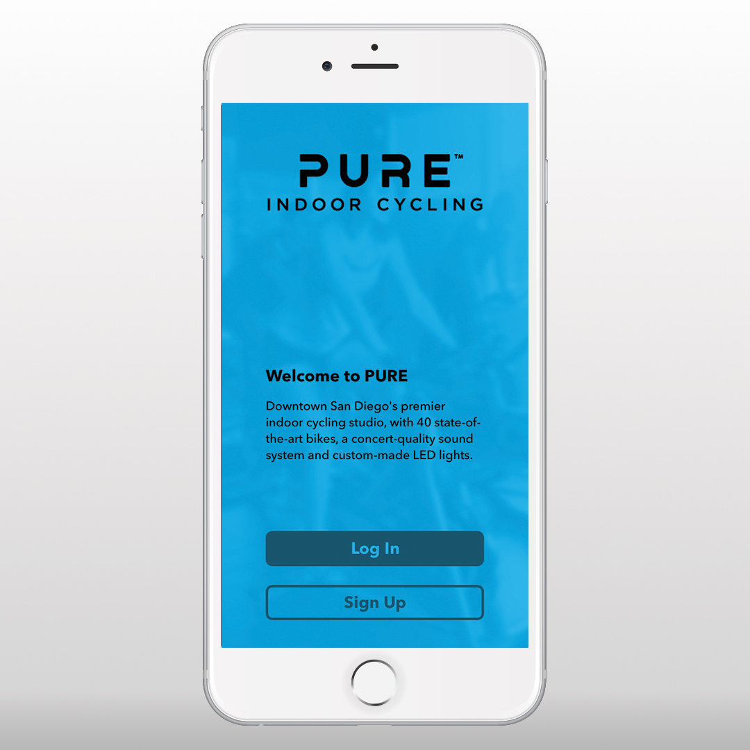
The onboarding process is the first experience users have with the app and is crucial for conversion and retention of the users. From a branding point of view, the app is one of the main brand touchpoints that users will be exposed to the PURE. The onboarding process needs to leave a good impression, aligns to customer values, and a clear process so that people can start exploring other aspects of the app.
RESEARCH
Competitive audits were done to look into design decisions. This helps the design and marketing team see the pros and cons of certain design decisions that were made; including art direction, userflow, and content.
Looking at competitors also reinforce or challenge business goals. Do we need content on the splash screen or not? Do we need a terms and conditions page in the onboarding? How do we want to break up this onboarding process?
DEFINING GOALS AND FLOW
After the audit, our team re-looked at the business goals for the onboarding process as well as customer feedback that we got from sales. Some unique goals were:
• Adding the brand statement
• Fast onboarding process
• Personal data. This includes:
name
address
email
username
password
foot size
profile pic
After that, some basic sketches were made to understand user flow and where to put specific content and info.
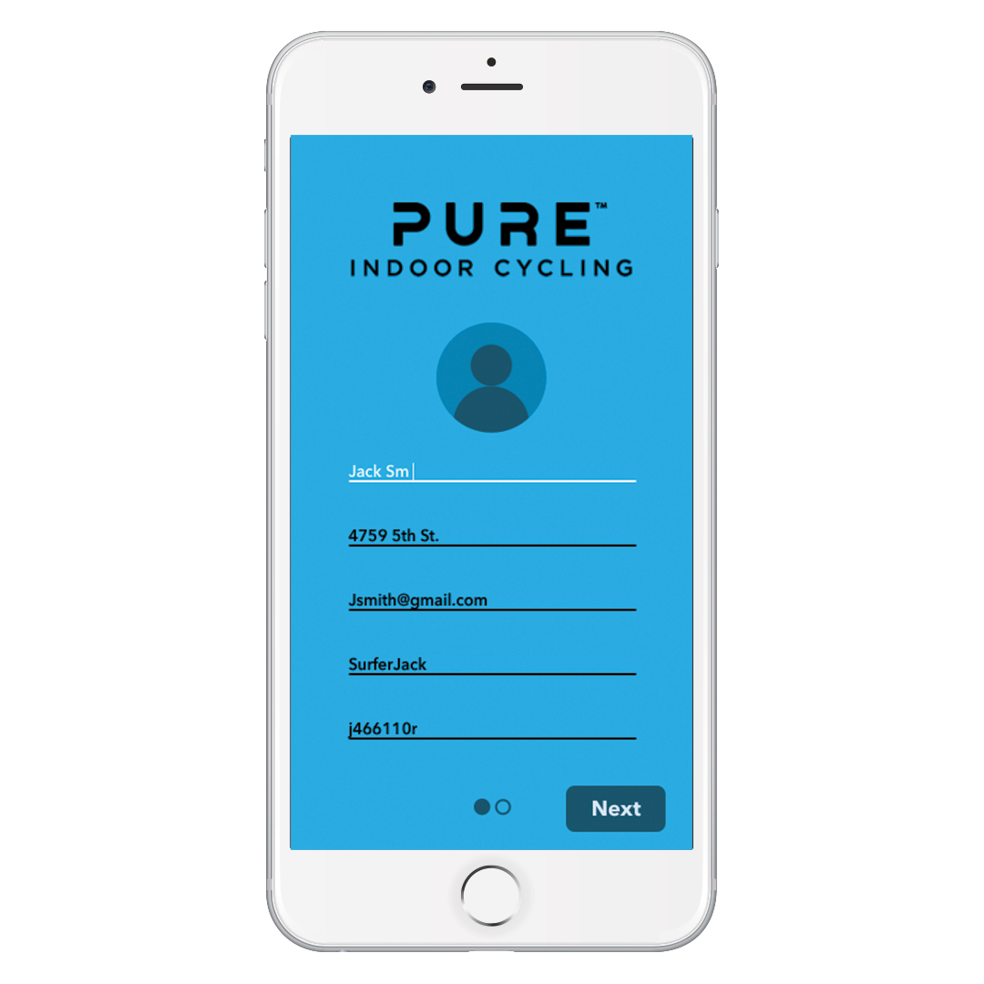
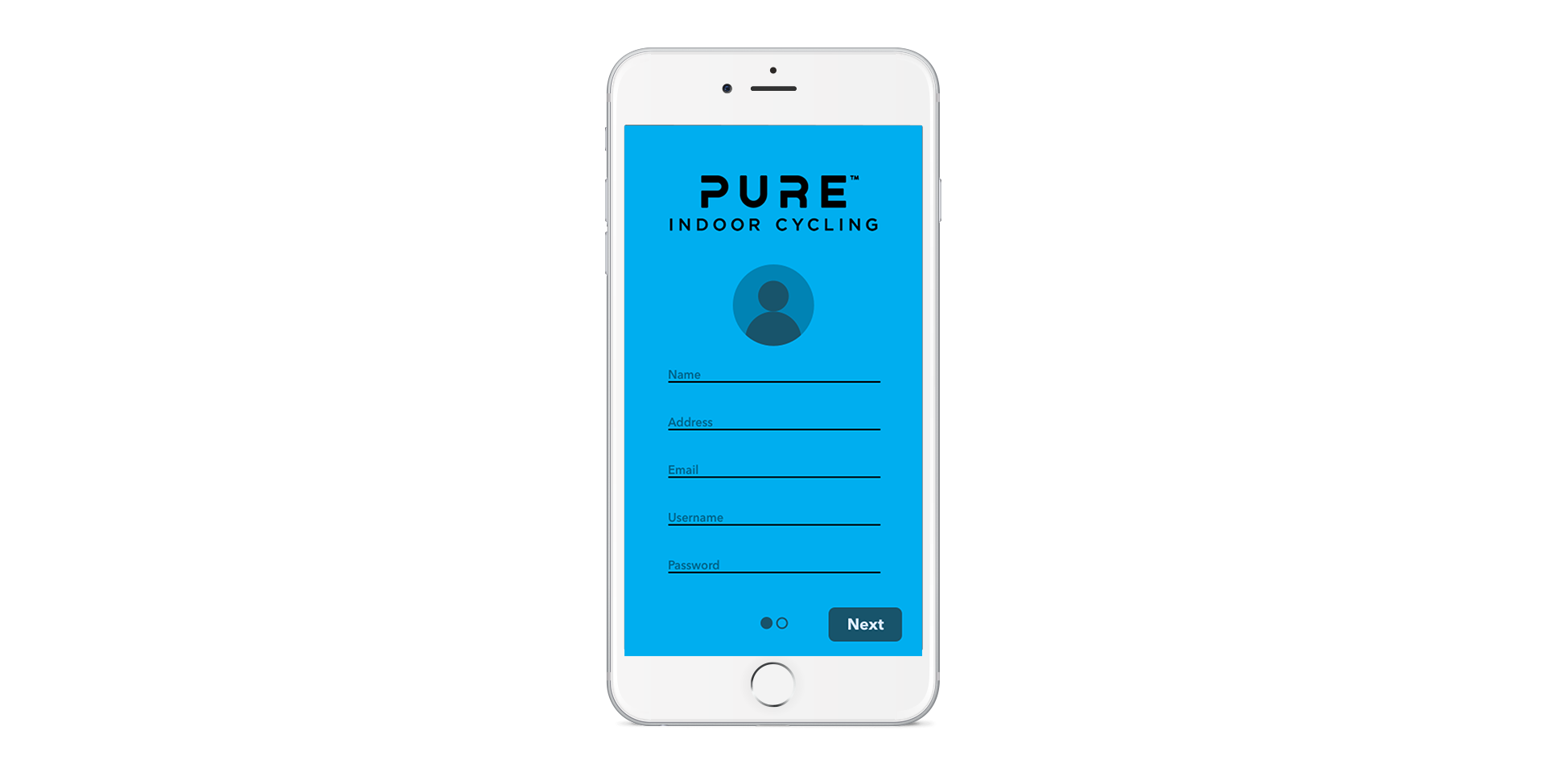
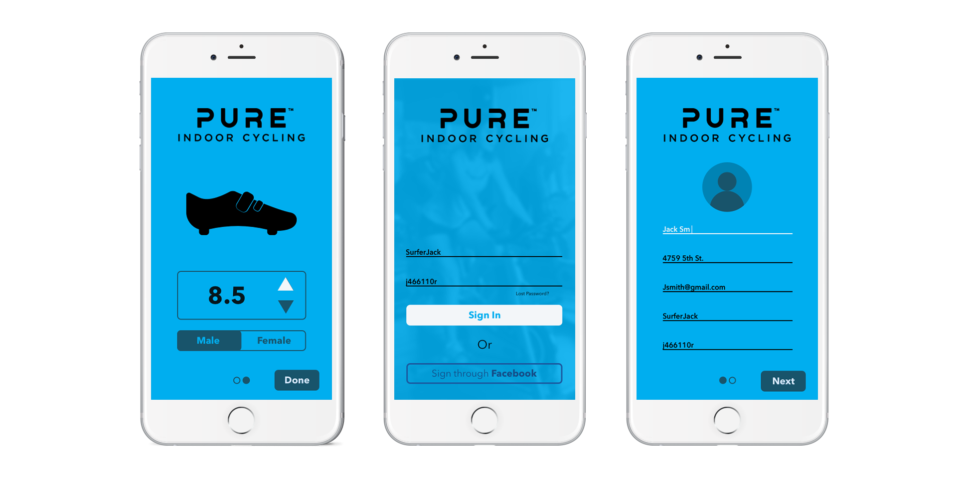
SIGN UP PROCESS
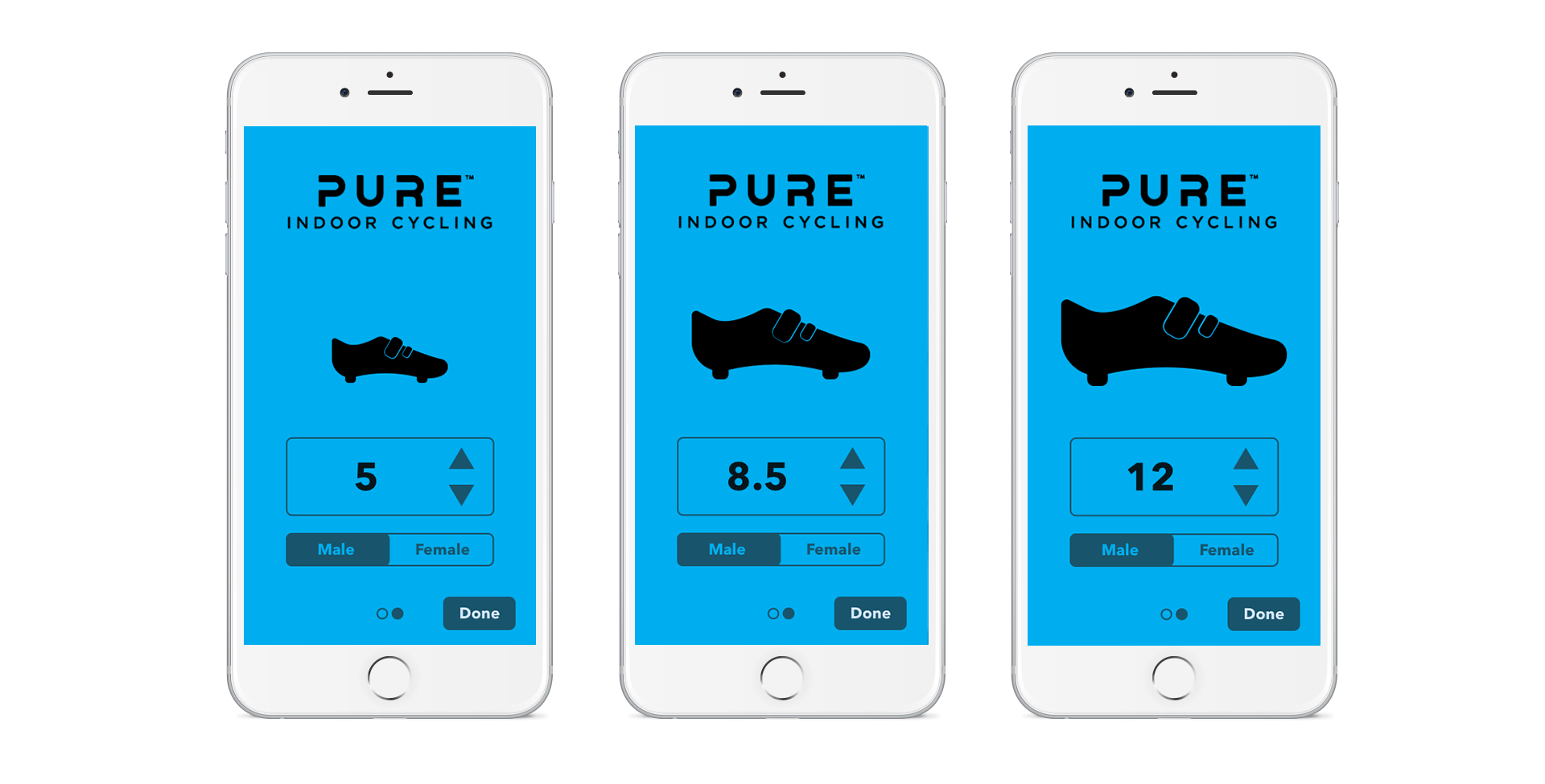
The team decided to make the sign-up process into two sections. All the form functions was added on the first page, and the foot size was on the second.
There wasn't a lot of personal info that PURE was collecting, so the idea was that we needed only one page for personal data, and another page for the foot sizing.
The foot size page is designed to be more of a "fun" aspect of the onboarding. The foot icon changes depending on the shoe size. This provides some interest after filling out a bunch of forms on the first page, and makes the onboarding process a bit more unique and memorable.
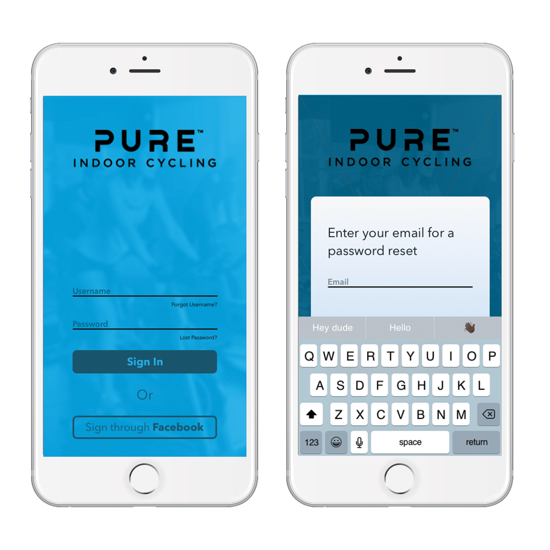
LOGIN
The users were given multiple ways of logging into their accounts. This was done so users don't have to spend enormous time and effort if they forgot their username and password.
Pressable footers were added underneath input forms, just in case users forgot their password or username. A module pops up where users can add their email to retrieve their forgotten info. Keyboard pops up when the module pops up.
An alternative login was provided via Facebook, since a majority of people remember their username and password for that account.
The goal is for users to login once and the app stores that data so that when the app opens up, it automatically brings them to the dashboard.
OTHER UI FEATURES
Microinteractions: Helps give users a visual indication that an action is currently happening. For this project, input forms and button interaction benefitted the most from this technique.
Progress Indicators: This was debated since our sign up process is only two pages if it was worth it or not. It was added because there's a chance that the onboarding process will change over the years, with more pages and it'll be easier to implement it later down the line.
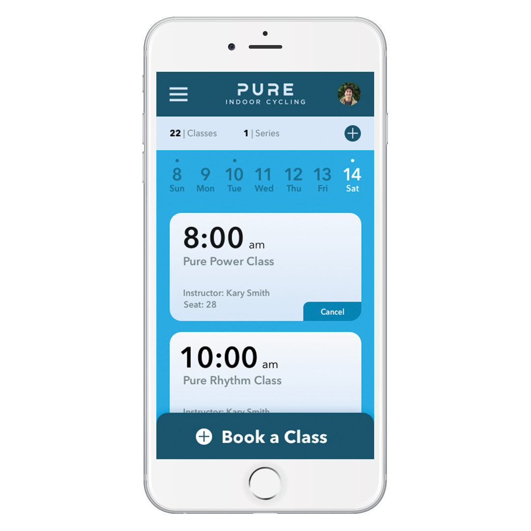
DASHBOARD
The dashboard was still being worked at the time of this project. This design was a sample screen to show the client that the onboarding process was done.
With research and testing still in process, this was the first stab at what the dashboard could look like. This dashboard showcased initial business objectives that the client requested. This included a calendar of bookings, a component where users can view how many classes they bought, and a card system that relied information about specific bookings.
Information about how many classes the user has bought is right underneath with an add button next to it. This was done intentionally so that users will automatically know if they are low on class passes.
Having a weekly calendar helps users access information about classes that they will take/took that week. This helps them schedule ahead or understand their planning habits more. The dots at the top indicates that there are classes booked that day. Once the user presses a certain day, the blue indicator and cards changes to that day.
Cards have information on them and hasn’t been properly analyzed yet. This shows what bookings the user made and the option to cancel. The info focuses on the time and class, so users can quickly and easily scan.
Adding a new class is easy with a static button at the bottom that users can easily access. The booking system is still being built out.

Results
Looking back, adding a third screen in the sign-up process would've been better, with having the password, username, and profile pic sectioned off into it's own screen.
This was the first iteration of the app and the first onboarding process for PURE. As PURE grows with a wider customer base, the onboarding process will have more unique questions to further personalize the app to the individual.
Credits
Marketing Manager — Philip Brown
Lead Designer — Cody Brown
UI Designer — Joe Repucci

Want to solve problems? Let me help you.
(805) 464-1100
Repuccidesign.com ©2020